Readers may have been following the ongoing debate between meteorologist Ray Bates and Peter Thorne of Maynooth University in relation to the most recent IPCC climate change report. The latest response by Ray can be read here. Some of it is quite technical but I want to focus on one part that any lay person can understand easily.
Prof. Thorne states: “Ray Bates goes on in his piece to imply nefarious intent behind the IPCC considering only the post-1960 series of GMST in their SPM figure. The choice is reasonable because the attribution statement in AR5 (and the prior figure) pertained to post-1950 changes. Furthermore, in the underlying chapter 1 Figure 1.2 the full series from 1850 is shown. The SR1.5 is hardly ignoring the early period as implied is it?”
My [Ray Bates] Reply:
In its Summary for Policymakers (SPM), SR1.5 did ignore pre-1960 temperature trends, as I stated. It is no defence of an omission in the SPM to point to a chart in the underlying report, the exclusion of which from the SPM is the whole matter at issue.
In Figure SPM.1, why was the obvious choice not made to show the post-1950 (corresponding to the period of the AR5 attribution statement) rather than the post-1960 changes? Prof. Thorne provides no explanation. Was the purpose to make it difficult for policymakers to see that cooling trends could occur while CO2 was increasing, as in the period 1950-1960?
This is the graph in question that was made for policymakers. You can see a clear warming trend and so there are no doubts that global warming is happening and CO2 is the cause.
 |
| IPCC graph starting in 1960 |
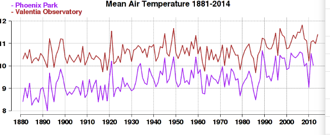
The issue at stake is why they decided to start from 1960 rather than 1950 or 1940 ? The answer can be seen in the very reliable temperature data at Valentia station in Co.Kerry (the red line below). Here, you can see a clear cooling trend from 1950 until 1980.
 |
| Valentia temperature record in red |
In the IPCC graph, see close up below, you can just about make out the tail end of this cooling period from 1960-1980 in the grey line but it isn't distinct enough to undermine the overall warming trend drawn in bright red and orange. If they had started from 1950, the cooling trend would be much more clear and they couldn't have shown the red line rising from the beginning of the graph. Instead, they would have needed to show a cooling trend preceding the runaway warm trend.
 |
| IPCC graph close up |
This would have given the impression as Ray Bates points out that cooling trends could occur while CO2 was increasing.
Leading to the inconvenient conclusion that CO2 does not always contribute to warming and that there are other factors, apart from CO2, that control the climate.
