Wednesday, 4 February 2015

Radio Debate on Wind Energy


There was a very good wind energy debate on the Pat Kenny show yesterday between Paula Byrne of Wind Aware Ireland and Kenneth Matthews of IWEA. It can be listened to here :

http://www.newstalk.ie/player/podcasts/The_Pat_Kenny_Show/The_Pat_Kenny_Show_Highlights/77230/1/are_wind_turbines_the_answer_to_irelands_energy_needs

It was interesting how Kenneth Matthews chides Paula Byrne for talking about emission savings from wind of 2.5% in all energy sectors (transport, electricity and heating), rather than the savings in the electricity sector only,  when he began the argument for wind by talking about the € 6 Billion of fossil fuel imports per annum, which comprises the fuel used in all sectors. In fact, 75% of the € 6 Billion fuel bill relates to oil, which makes up a tiny proportion of fuel used in electricity :

“While penetration of renewables continues, our fossil fuel import bill was still €6 billion in 2011, with oil accounting for three quarters of that. - See more at: http://www.seai.ie/News_Events/Press_Releases/2012/Renewable_electricity_avoided_approximately_%E2%82%AC300_million_in_gas_imports_in_2011.html#sthash.QHXT31mQ.dpuf


Tuesday, 3 February 2015

2014 was NOT the hottest year on record (in Ireland)


Its easier for the world to accept a simple lie, rather than a complex truth
- Alexis de Tocqueville, 19th century French philosopher

Valentia Observatory in County Kerry provides temperature data not compromised by urban heat and for this reason is the most reliable source for temperature data in Ireland. With the media reporting on IPCC's claims for 2014 as "Hottest Year on Record" , did anybody think to check the records in Ireland themselves ? Well, Irish Energy Blog did. 30 year data for each observatory can be accessed from Met Eireann here :

http://www.met.ie/climate-request/

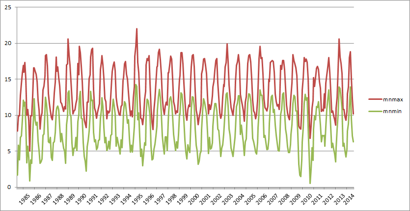
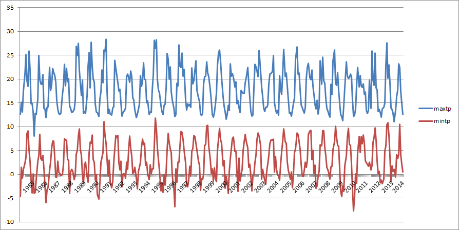
The following graphs show mean maximum / minimum (Figure 1) and actual maximum /minimum (Figure 2) temperatures since 1985 :

Fig 1: Valentia Observatory, Mean Max and Min Temperatures 1985 - 2014

Fig 2: Valentia Observatory, Max and Min Temperatures 1985 - 2014
Figure 1 shows that 1994 was a much hotter year on average than 2014. 2013 and 1989 were also warmer. If we look at Figure 2, the actual max temperatures, we can see that 2014 was not a very warm year relative to preceding years. In fact, 17 out of the previous 30 years recorded higher temperatures.

As for winter temperatures, they were relatively normal when compared with most of the preceding years
.

So what do these graphs tell us - do you see a warm or even a cooling trend ? Well, I dont see any trend at all. The temperature has remained relatively consistent with a few exceptions as one would expect in a complex system like our climate. Oddly enough, this ties in with my memory of the Irish climate over the past 30 years - for example, 2013 was very warm and 2010 was indeed a very cold year.

So how rational is it for Ireland to be doing a solo run on "climate change" action ? Which, by the way, is not working, not reducing CO2 emissions (rather simply outsourcing them), leading to more inequality and helping to erode what is left of our competitiveness. Has mass hysteria and group think taken root once again in the land of Saints and Scholars ?


The Global Dimension


The following is an analysis of climate trends globally so as to put the current global warming mass hysteria into context.  

One has to ask the question as to whether calculating a "global" temperature for 2014 has any meaningful value in the first place. Consider the following :


  1. Where do you pick your temperature measurements? Clearly if we were relying on Dublin data rather than Valentia or Armagh Castle over the second half of the twentieth century, we would come to different conclusions. This is known 'cherry picking' and adjustment of the raw data. 
  2.  Can we measure a single global temperature of relevance anyhow, when there are known annual variations and cycles in different parts of the world, in particular the El Nino Southern Oscillation.
  3. How can IPCC claim that 2014 was the hottest, when their 'number' was 0.04C higher than previously. You couldn't read a thermometer to that level of precision so this is a major flaw as the UK Met Office explained later :“The HadCRUT4 dataset (compiled by the Met Office and the University of East Anglia’s Climatic Research Unit) shows last year was 0.56C (±0.1C) above the long-term (1961-1990) average. Nominally this ranks 2014 as the joint warmest year in the record, tied with 2010, but the uncertainty ranges mean it’s not possible to definitively say which of several recent years was the warmest.”
NOAA explain that warmer global oceans accounted for much of the increased warmth during 2014 :

Much of the record warmth for the globe can be attributed to record warmth in the global oceans 
(link http://www.ncdc.noaa.gov/sotc/global/)

So what actually was going on ? Well, the reality was that there was a weak El Niño in the Pacific Ocean :

Tropical Pacific Ocean surface temperature anomalies exceeded the threshold for a weak El Niño during November, with values of 0.5 to 1.0 degrees Celsius above normal. Some atmospheric indicators have also become indicative of weak El Niño, while others have remained neutral throughout the recent several months;
(link: http://www.wmo.int/pages/prog/wcp/wcasp/enso_update_latest.html)

But while this warmth was going on in the Pacific, North America was finding it very very cold indeed :


 In contrast to all other land areas around the world, much of North America had below-average temperatures for much of the year, particularly during early 2014 due to a series of cold Arctic outbreaks and a persistent dip in the jet stream that moved warm air northward into Alaska and northern Europe and cold air southward into North America and central Russia. According to Environment Canada it was the coldest meteorological winter (December 2013–February 2014) for the country since 1996, but with cold settling in before this official start to winter and remaining after its official end, Canada observed its coldest November–March since national records began in 1948. Record snowfall in some regions also accompanied the cold. Saskatoon had snow on the ground for six straight months, the longest period with continuous snow cover since records began there in 1955. The United States had its 33rd coolest winter in the 120-year period of record, with many states east of the Rockies having their coldest winter since the 1970s. The ice cover over the Great Lakes was the second largest since records began in 1973 (link http://www.ncdc.noaa.gov/sotc/global/).

The bottom line is, if there was any warming in the last 18 years, it was absolutely minuscule, despite the alarmist predictions of the IPCC's computer models. So we should just be sensible and forget about those models, as an increasing amount of people and countries are doing. At the end of the day, it is like saying alcohol causes babies, well it does, but that is missing the point, the overwhelming number of babies are natural and not influenced by alcohol - exclusively so in the Muslim world(?). So we are not entering a doomsday environmental overpopulation scenario as a result of alcohol. Similarly, the overwhelming driver of climate is natural, which these doomsday IPCC models fail to replicate, as they simply do not understand those complex and long term processes going on. 


 “Within a few years winter snowfall will become a very rare and exciting event. … Children just aren’t going to know what snow is.”David Viner, Climatic Research Unit, University of East Anglia, 20 March 2000
“The Arctic seems to be warming up. Reports from fishermen, seal hunters, and explorers who sail the seas about Spitzbergen and the eastern Arctic, all point to a radical change in climatic conditions, and hitherto unheard-of high temperatures in that part of the earth’s suface.”
The Washington Post: “Arctic Ocean Getting Warm; Seals Vanish and Icebergs Melt.” 2 Nov 1922.
In fact, there  is a sixty year cycle in the oceans, driven by the hot and cold phases of the Pacific Decadal Oscillation (PDO) :
pacific decadal oscillation index
From : http://oceanworld.tamu.edu/resources/oceanography-book/oceananddrought.html


So we are going back into the cold phase, which is why Artic sea ice is now starting to increase again.

When one actually reads the IPCC's own reports, rather than media articles, you will see that IPCC acknowledge these processes and complexities in the Earth's climate (link to report):

There are fundamental limits to just how precisely annual temperatures can be projected, because of the chaotic nature of the climate system. Furthermore, decadal-scale projections are sensitive to prevailing conditions—such as the temperature of the deep ocean—that are less well known. Some natural variability over decades arises from interactions between the ocean, atmosphere, land, biosphere and cryosphere, and is also linked to phenomena such as the El Niño-Southern Oscillation (ENSO) and the North Atlantic Oscillation (see Box 2.5 for details on patterns and indices of climate variability).


So is it really worthwhile spending all this money on these energy projects because of a bogeyman, when in fact, these projects won't really have much of an impact on defeating the bogeyman even if he did exist anyway ? The current estimate for expenditure on Renewable Energy infrastructure in Europe is now at € 600 billion plus, around 1.5 times that of the total combined cost of Ireland's and Greece's bailout. Figures are provided below.
--------------------------------------------------------------------------------------------------------------------
The 2013 Edition of the State of Renewable Energies in Europe [link]:

  • 106,757 MW of total wind energy in EU 28 by end of 2012
  • 5,022 MW of offshore wind energy installed by end of 2012
  • 68,906 MW of installed photovoltaic cells by end of 2012

Inline image 1

  • Cost of solar PV[link]:
  • Assume an average of $7.5 per W, €6.25 per W. €6.25 million per MW.
  • Total: (68,906 x 6.25) + (101,735 x 1.7) + (5,022 x 3.5) = €621,189 million.

So the total is  in excess of €600 billion, to which grid connections and upgrades have not been added.


Thursday, 29 January 2015

More on the Energy Bubble


Figure 1: How generating capacity has increased since 2006. East West Interconnector included in 2013 and 2014, also Great Island CCGT included in 2014 and retired oil plant on same site taken out


The above graph, Figure 1, shows the levels of electricity generation capacity for the Republic of Ireland at the end of 2014. We are now approaching the 10 GW mark, the highest ever in the State. If you really want to know why your electricity bills are so high then you only need to look no further than the above graph. All the above power stations and wind farms have to be financed through our bills, even though we only use on average less than a third, and at peak times less than half, of this capacity in electricity. The key to understanding this graph is looking at the gap between the blue (average demand) and black line (total capacity including wind) and the red (peak demand) and black line in 2006 and then comparing this gap with the current gap in 2014 (See Figure 2). As you can see, it has gone out of control. Consider that back in 2006, when the economy was booming, there were no blackouts . The level of back up capacity was sufficient but now that we have over 2GW of wind, it appears that more back up capacity is required to maintain a stable and reliable system.


2006
2014
Total Capacity
/ Average Demand
2.0 times
3.2 times
Total Capacity
/ Peak Demand
1.3 times
2.0 times
Figure 2: Total Capacity is now over 3 times that of average demand and double that of peak demand

There is an argument put forward by the Greens that this excess capacity will be required when everyone switches over to electric cars and electric heating systems as this will lead to a surge in average and peak demand. But there is a major flaw in this argument. You would still need enough dispatchable plant (i.e. plant that can be switched on and off at the touch of a button rather than when the wind blows) at least equal to the peak demand under this scenario, no matter how many wind farms there are. Otherwise, what would everyone do on a calm day like the 11th October 2014 ? Cycle the 10 or 20 miles or more to work ? Or perhaps wear extra woolly jumpers ? So you would still need to build more power stations to cover the surge in demand under this scenario and wind turbines would still result in excess capacity just like in the above graph.

Fuel Mix 2013 - another historic milestone


Figure 3: Fuel Mix 2013 with UK imports broken down into original fuel sources

Figure 3 shows that in 2013, Ireland used nuclear power for the first time. 2% of the electrons going into your electric socket in 2013 came from nuclear stations in the UK. I have broken down the power consumed here through UK imports into their energy sources and added that to the fuel mix provided by SEAI to arrive at the above chart. UK coal power accounted for 40% of our imports with gas at 25% and nuclear at 21%. The 10GW or so of UK wind provided just 6% of imports. So we are still very reliant on gas and coal power - almost 70% of the electrons entering your home in 2013 came from gas and coal power. (not including spinning reserves or back up generation)

But when we look at SEAI's original chart it tells an interesting story :

Figure 4: SEAI Fuel Mix 2013


While on the face of it, wind power did well, one has to put the output of a generator in the context of its generating capacity. The following table (Figure 5) shows the share of generating capacity each energy source had in 2013, so for example, gas plants made up 44% of the entire power plant and wind farm fleet in 2013.


Ireland's Power Generation Mix
2013
Gas
44%
Wind
20%
Coal
9.5%
Peat
4%
Interconnection
5.5%
Oil
12%
Hydro
2%
Pumped
3%
Figure 5: Generating mix 2013

Definitions used :

Grid Acceptance Rate (GAR): the rate at which when power becomes available from a generating source that it is accepted by the grid. So wind power has a grid acceptance rate of 1:1 because it has priority dispatch, meaning when wind power is available it is automatically taken by the grid. Gas has a GAR of between 1:0.8 - 0.9 because when wind becomes available it pushes gas off the grid. I will assume 1:0.85 for this analysis. Coal and Peat are assumed to have a GAR of 1:0.95 as they are occasionally pushed off by wind

Fuel / Capacity Ratio : the position of a fuel source in the fuel mix relative to its position in the generating capacity mix. So a fuel source that makes up 50% of the capacity and 50% of the fuel mix will have a fuel / capacity ratio of 1:1.

Gas power gave just over 1MW power for 1MW share of capacity so had a fuel / capacity ratio of 1:1. Peat gave over twice as much power as capacity (2:1) while coal gave approx 1.6MW power for 1MW capacity (1.6:1). It is no surprise that the highest emitting power sources produced the most power relative to their size. This is because coal and peat store higher concentrations of energy than other fuel sources having formed over millions of years. Oil power, representing 12% of capacity, had a negative fuel / capacity ratio because these plants were lying idle most of the time. Oil plant are mostly used for "peaking" , i.e. when peak demand goes above normal which doesn't happen very often nowadays. So it had a significantly low Grid Acceptance Rate (somewhere around 1:0.01), whereas gas, peat and coal had GARs very close to 1:1 (between 1:0.85-0.95)


So how did wind do? Well, it had a negative output relative to its share of capacity. It comes out at 0.8MW of power for each share of MW installed. This is despite it having priority dispatch i.e. when the wind blows, the power is taken straight away by the grid. So levels of other power sources - mostly gas, and sometimes coal and peat - are reduced when wind is available. Applying the above definitions, this means that wind had the best Grid Acceptance Rate of all fuel sources i.e 1:1, but had a negative fuel / capacity ratio of 0.8:1. So wind and oil came out the worst, but oil had the lowest Grid Acceptance Rate, whereas wind had the highest. What this shows is that wind is a poor storage of energy when compared to coal, gas, peat and oil and storage solutions cannot solve this problem, rather it simply transfers the storage of this energy from one hour to another. What is required is a renewable source that contains higher concentrations of energy


And herein lies the problem with wind energy - you can't run a reliable grid if you install power plants that almost always give a negative fuel / capacity ratio. If you install 1,000 MW of wind, and demand hits 1,000MW, the power from the wind will almost always be less than 1,000MW so you have a blackout. This problem means that wind energy can never replace conventional plant and so competitiveness goes out the window